
Why the current landscape of speculative design is looking a bit too familiar—and what we should do about it.

One of the unavoidable realities of spending time in UK design communities is the sheer repetition of visual cues. Open any trending portfolio, and you will be greeted by the same grim, neon-lit alleyway. The same rusty metal panels. The same holographic glitches. The same aggressively angry vehicle parked in a rain-slicked dystopia.
It’s a bit like seeing the same man in the same beige trench coat at every bus stop. You have to wonder—is this a passionate choice, or are we simply looking at a habit nobody has bothered to question?
This isn't a matter of technical incompetence. The rendering quality across the UK design industry has never been higher. The geometry is clean, the lighting engines are powerful, and the software is incredibly accessible. Yet, for all this technological advancement, the visual output has largely remained stagnant. We are drowning in visual noise, yet starving for originality.
If speculative design in the UK is meant to imagine the future, why does it look so aggressively like the past?
The Algorithm Trap: Why Speculative Design Repeats Itself
The issue isn't that these visuals are technically poor. Most are rendered with impressive skill. The issue is that they are safe. They chase an established aesthetic that the algorithm has already deemed popular. As a result, "future design" has become an aesthetic genre of its own—one where visual clutter and glowing elements are mistaken for sophistication.
It is a trap we see many British studios fall into, and we have actively chosen to avoid it. The algorithm rewards the familiar. It rewards the trope that the human eye has already been trained to accept. When a designer sits down to create a "sci-fi" concept, their brain doesn't ask, "What does the future actually look like?"; it asks, "What have I seen in a film that I can recreate?" The result is a copy of a copy of a copy—an endless loop of creative tribalism.
At Lightson Design Lab, we believe speculative design should ask questions, not just recycle moods. If a concept feels like it belongs in a video game from 2015, it probably doesn't belong on our timeline.
Our portfolio demonstrates how we break free from these tropes.
A Brief History of the Future Design Aesthetic
To understand why we are where we are, we have to look back at where "future design" originated. For decades, the visual shorthand for the future was dictated by the budget constraints of cinema and the limitations of early video game graphics. To sell a film set in a dystopian world, sets were covered in practical wiring, dilapidated concrete, and industrial grime. To render that in a video game, the lighting had to be heavy on neon bloom to hide the lack of texture detail.
These were necessary constraints at the time. They were practical workarounds.
Somewhere along the line, however, these constraints became a stylistic obsession. The practical became the desirable. The limitation became the identity. And when 3D rendering software finally became powerful enough to render anything—sunlight, glass, organic materials, expansive natural landscapes—a vast majority of the industry simply carried the same old aesthetic with them. They kept the neon. They kept the grime. They kept the aggressive, angular geometry. They never stopped to ask if there was another way.
It is a design language born from necessity, kept alive by nostalgia. It is not a forward-thinking aesthetic; it is a historical accident that we have decided to worship.
This is not to say that cyberpunk or dystopian aesthetics have no value. They do, as a narrative device. The issue is that they have become the default setting for any designer who doesn't want to upset a client or risk failing a social media algorithm. It has become an institutional habit.
When you see a concept vehicle, you can already predict the lighting. You can predict the environment. You can predict the material finishes. The surprise has been engineered out of the process. And when surprise is removed from speculative design, we are no longer imagining a future. We are simply curating the past.
The Psychology of Copying in Design
We must ask ourselves a difficult question: Why are we so afraid to diverge from the established tropes?
The answer is rooted in the fear of failure. In the world of concept art and online portfolios, the metric of success is often "likes" and "shares." These are quantitative measures, not qualitative ones. A render that fits the mould of a cinematic, dystopian scene is likely to perform well because the audience has already been conditioned to recognise it as "good." It is a dopamine hit for the viewer, and a validation hit for the designer.
But validation is not the same as progress.
Designing for the algorithm is a notoriously limited practice. It prioritises instant recognition over enduring value. It rewards the trend instead of the timeless. And by doing so, it strips the designer of their most valuable asset: their unique point of view.
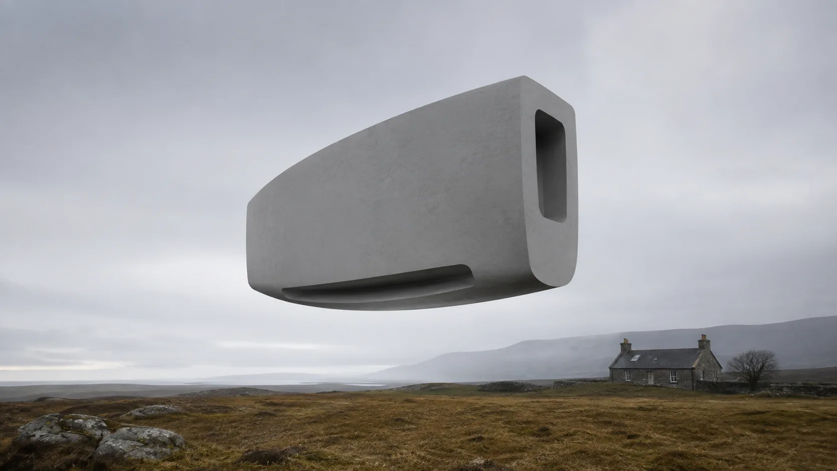
At Lightson, we actively resist this gravitational pull. We do not create to feed a machine; we create to build a system that stands apart from the machine. We look at a brief and we ask: What would happen if we took away the neon? What happens if we remove the aggressive angles? What happens if we make this object quiet?
Sometimes, the most radical thing you can do is simply remove the visual noise.
Designers are visual problem solvers. When we allow the aesthetic to precede the function, we are solving the wrong problem. We are solving for "how to get this past the client," rather than "how to make this unmistakably mine." The distinction is subtle, but it changes every single line of code and every single edge of a model.
The Alternative: Architectural Thinking and Restraint in UK Design
If we are to break out of this uniform future, we must pivot our methodology. We must stop treating visual design as a surface-level application of textures and lighting, and start treating it as an exercise in architectural thinking.
At Lightson Design Lab, a future design agency based in the UK, we operate on a set of three principles that govern every project we touch, whether it is a physical object or a digital concept. These principles are our internal resistance to the algorithm.
- Sculpted Mass. Volume shaped with intention, never bulk for its own sake. Every surface earns its place. Every curve has a reason. Nothing is inflated to impress. In an industry obsessed with aggressive, oversized forms to convey "power," we find that weight is actually established through deliberate reduction. A monolithic shape, carefully considered, conveys far more confidence than a chaotic jumble of geometry. The weight is real, but the shape is deliberate.
- Tactical Elegance. Premium utility refined until nothing unnecessary remains. This is not decoration. It is reduction. The luxury is in what was removed, not what was added. Every detail serves a function, but the function is executed with a taste that cannot be replicated by a cheaper hand. It is one thing to add gold trim to a product; it is entirely another to shape the product in such a way that it doesn't need gold to look premium. That is the difference between decoration and design.
- Cinematic Restraint. Atmosphere that commands attention without raising its voice. The studio does not shout. The renders are not loud. The lighting does not scream. Instead, the image holds you still. It makes you lean in. This is a direct counter to the neon-drenched visuals that dominate our feeds. We prefer shadows that are truly dark, highlights that are earned by natural light, and colour palettes that feel grounded in physical reality rather than a colour-grading LUT.
These three principles form the DNA of the studio. A client may not know these words. But they will feel them in the work.
Consider how these principles alter the process. When you work from a place of Cinematic Restraint, you are forced to understand the physics of light. You cannot rely on a glow effect to mask the shape; the shape must hold its own weight in the dark. When you work from Sculpted Mass, you cannot rely on a noisy texture to distract from a lack of form; the form must be compelling on its own. These constraints, far from limiting the output, actually force a higher level of intellectual rigour into the process.
Explore more design thinking on Fast Company.
A Case for the Future of Premium Design Concepts
We firmly believe that the future of premium visual concepts does not lie in the proliferation of more aggressive, noisier renders. The future lies in the reintroduction of maturity, restraint, and true craftsmanship.
We are living in a time where the software is faster than the mind. It takes minutes to apply a texture, but hours to develop a coherent design philosophy. We believe the value of a studio lies entirely in the latter. Our commitment to this approach is not just a stylistic preference; it is a strategic positioning. By focusing on timelessness rather than trendiness, we ensure that our work remains relevant years after it is published. A concept vehicle rendered in a muted, monolithic environment will age far better than one that relies on the neon-rain aesthetic of the current decade.
We are currently in the foundation phase of our studio, building the visual systems that will define our work for years to come. It is a process of deliberate iteration and ruthless editing. We look at every concept and we ask: "Does this communicate purpose?" If the answer is no, we begin again.
Key takeaways for UK designers and studios
- Stop designing for the algorithm – design for longevity and cultural impact.
- Apply Sculpted Mass, Tactical Elegance, and Cinematic Restraint to every project.
- Always ask: "What happens if I remove the neon?" – reduction often reveals true quality.
Final Thoughts
The design world is vast, and there is room for many different approaches. But we have found that the most respected voices—the ones that define the culture, rather than reacting to it—tend to be the ones that refuse to compromise on their point of view. They don't chase the algorithm. They don't overcrowd their frames. They build slowly, with precision, and they ask the hard questions before they touch the software.
We are not here to create more visual noise. We are here to build visual authority—and that starts with knowing what we refuse to do.
We build before we decorate. We iterate deliberately. We think across mediums. And we ask, not "What should I make?", but "How do I make this unmistakably mine?"
That is the question that drives everything at Lightson Design Lab.
Now, we get to work.
Explore our portfolio to see how we apply architectural thinking and restraint.
— Lightson Design Lab
© 2026 Lightson Design Lab. All rights reserved.
Comments
No comments yet. Start the conversation.